|
|
Disneyland Signs Part 1: 1955 to 1999 |
||
|
|
|||
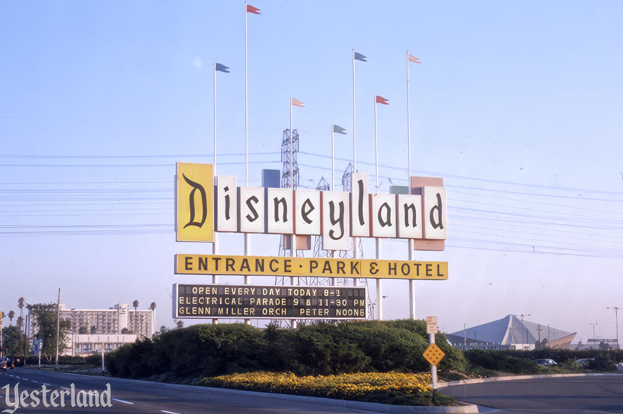
Photo by Werner Weiss, 1974 |
|||
|
When you think of the Disneyland sign, what do you visualize? It probably depends on when you first visited Disneyland or became aware of its sign. When I launched Yesterland in 1995, the site’s masthead was based on the iconic marquee sign which stood along Harbor Blvd. from 1958 to 1989. There’s now a newer Yesterland masthead at www.Yesterland.com—but it still looks like the Disneyland sign that I remember. Let’s look at Disneyland signs through the years. Don’t miss Part 2. There’s a link at the end.
updated and expanded from a Yesterland article originally published August 29, 2014 |
|||
|
|
|||
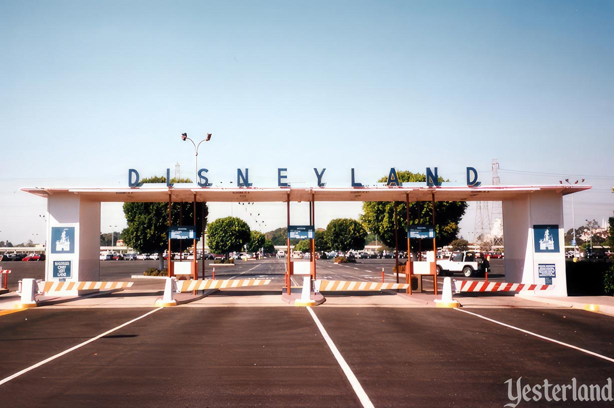
Photo by Chris Bales, circa 1990 Katella entrance to the Disneyland parking lot |
|||
|
When Disneyland opened in 1955 at 1313 S. Harbor Blvd. in Anaheim, there was no landmark sign on the boulevard. Billboards along the Santa Ana Freeway directed drivers to the correct exit, but, after that, the park served as its own identifier. In the years before the Matterhorn or towering mature trees, the TWA Rocket to the Moon—80 feet tall, including its legs—was an easily visible landmark that left no doubt that this was Disneyland. There were two parking toll plazas. (All-day parking was 25 cents.) Whether guests drove in from Harbor Blvd. or Katella Ave., widely-spaced letters spelled D I S N E Y L A N D above the toll booths—essentially the first Disneyland signs. The main entrance on Harbor Blvd. was remodeled and expanded several times over the years, but the smaller Katella Ave. entrance remained almost unchanged (and usually closed) until it was removed in 1998 to make way for Disney’s California Adventure. |
|||
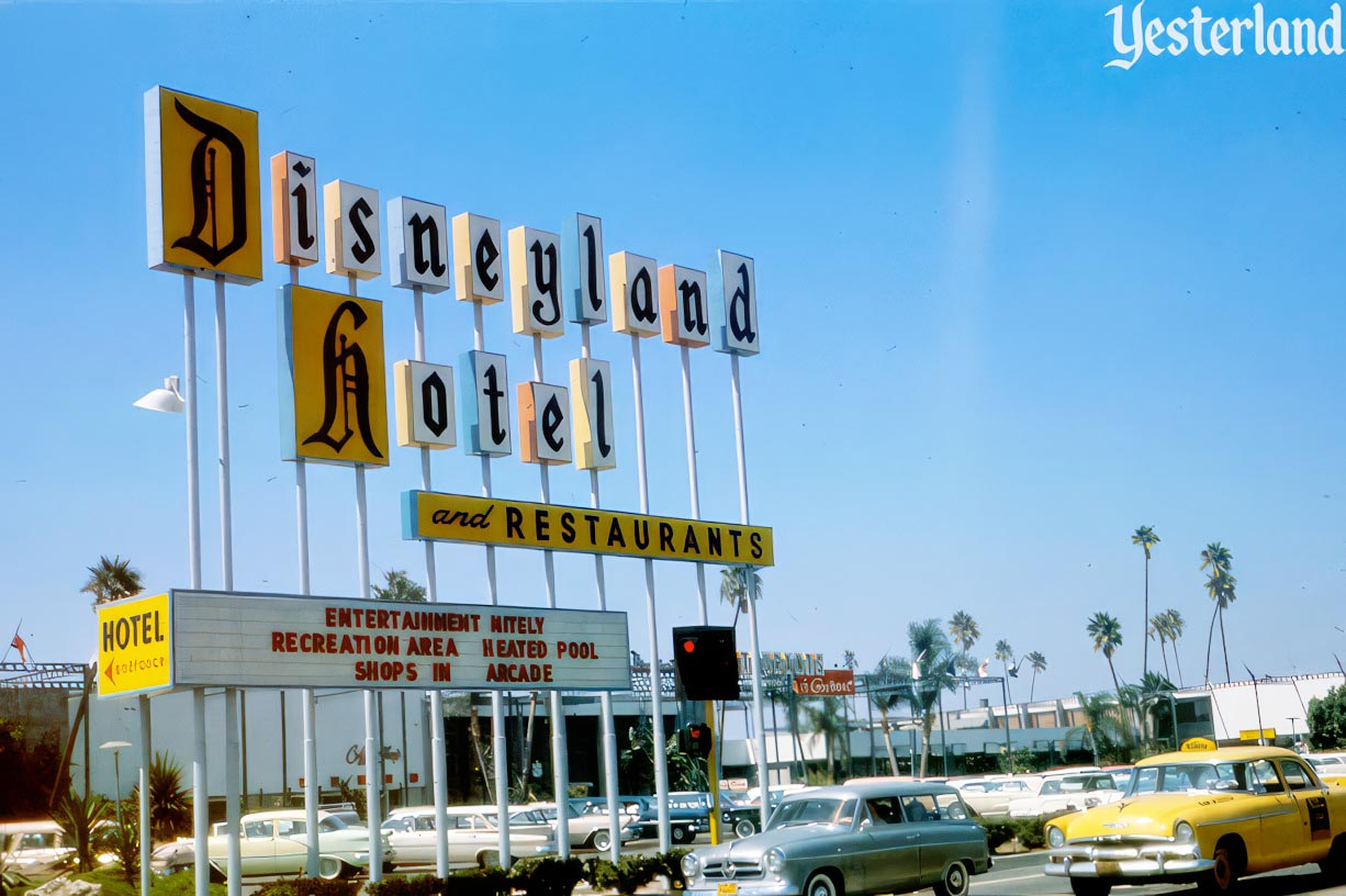
Photo by Roger J. Runck, 1960, courtesy of Robin Runck Disneyland Hotel sign across West St. from the Disneyland parking lot |
|||
|
The Disneyland Hotel had a big marquee sign by 1956, soon after it opened in 1955. Each letter was on an individual panel, with yellow panels for the capitalized D and H. Originally erected in front of the hotel’s administration building, the sign was moved to the West Street curb in 1957. |
|||
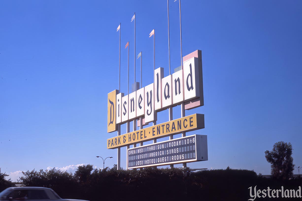
Photo by Werner Weiss, 1974 The older Disneyland marquee sign (1958-1989) |
|||
|
Somebody must have noticed that the Disneyland Hotel had a big, fancy, eye-catching sign, but Disneyland Park didn’t. In 1958, Disneyland finally gained the Harbor Blvd. marquee sign that would greet visitors for more than 30 years. On each of its two sides, a huge D on a yellow panel was followed by the other letters on separate white panels. At night, the backlit panels would glow. Tall poles supported colorful, rigid banners. |
|||
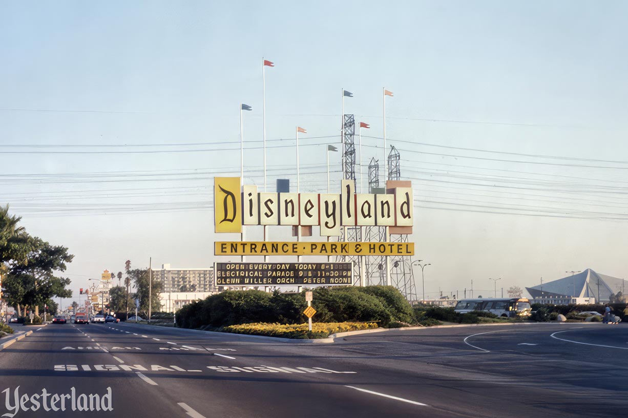
Photo by Werner Weiss, 1974 Looking south |
|||
|
The sign included a yellow panel with “Park and Hotel - Entrance” on one side and “Entrance - Park and Hotel” on the other. Despite the reference to the hotel, it was faster to take Katella Ave. and West St. around the outside of the parking lot if your destination was the Disneyland Hotel. Changeable marquees facing north and south could provide information about Disneyland hours, off-season days closed, special events, and new attractions. Originally, the changeable marquees were low-tech and somewhat smaller, with plastic letters positioned on a white plastic background changed by hand (or, more accurately, by a worker with a long pole)—just as at the Disneyland Hotel or at movie theater marquees of that era. The electronic marquees in these 1974 photos replaced the originals in Spring 1971. |
|||
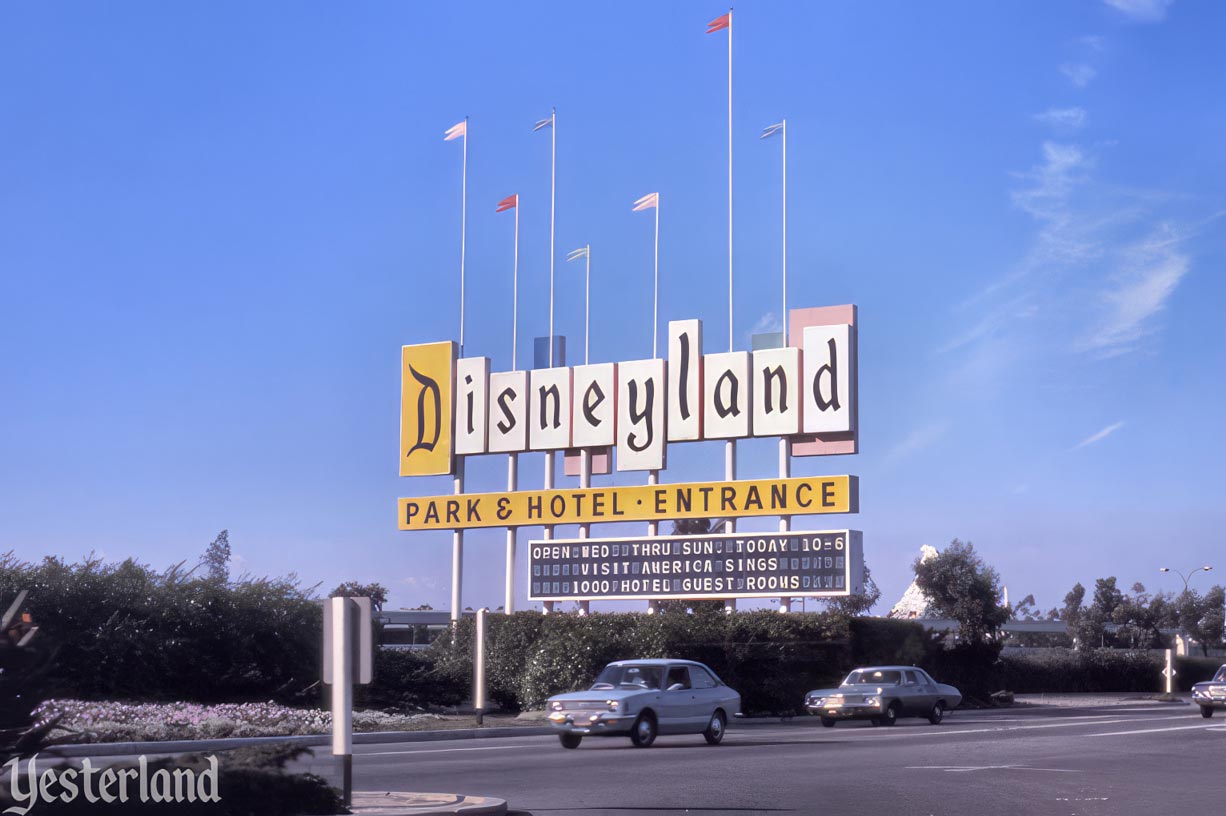
Photo by Werner Weiss, 1974 Looking north |
|||
|
By the 1970s, the sign looked dated. The design and execution both screamed 1950s—and that was long before retro-1950s designs were considered something good. When America on Parade opened in 1975, the background for the D was changed from yellow to white. The horizontal yellow “Park and Hotel” panel became a white panel emblazoned with “America on Parade” in red letters. In the years that followed, new panels read “The Happiest Place on Earth,” “The Best Has Just Begun,” and finally “The Happiest Place on Earth” again. |
|||
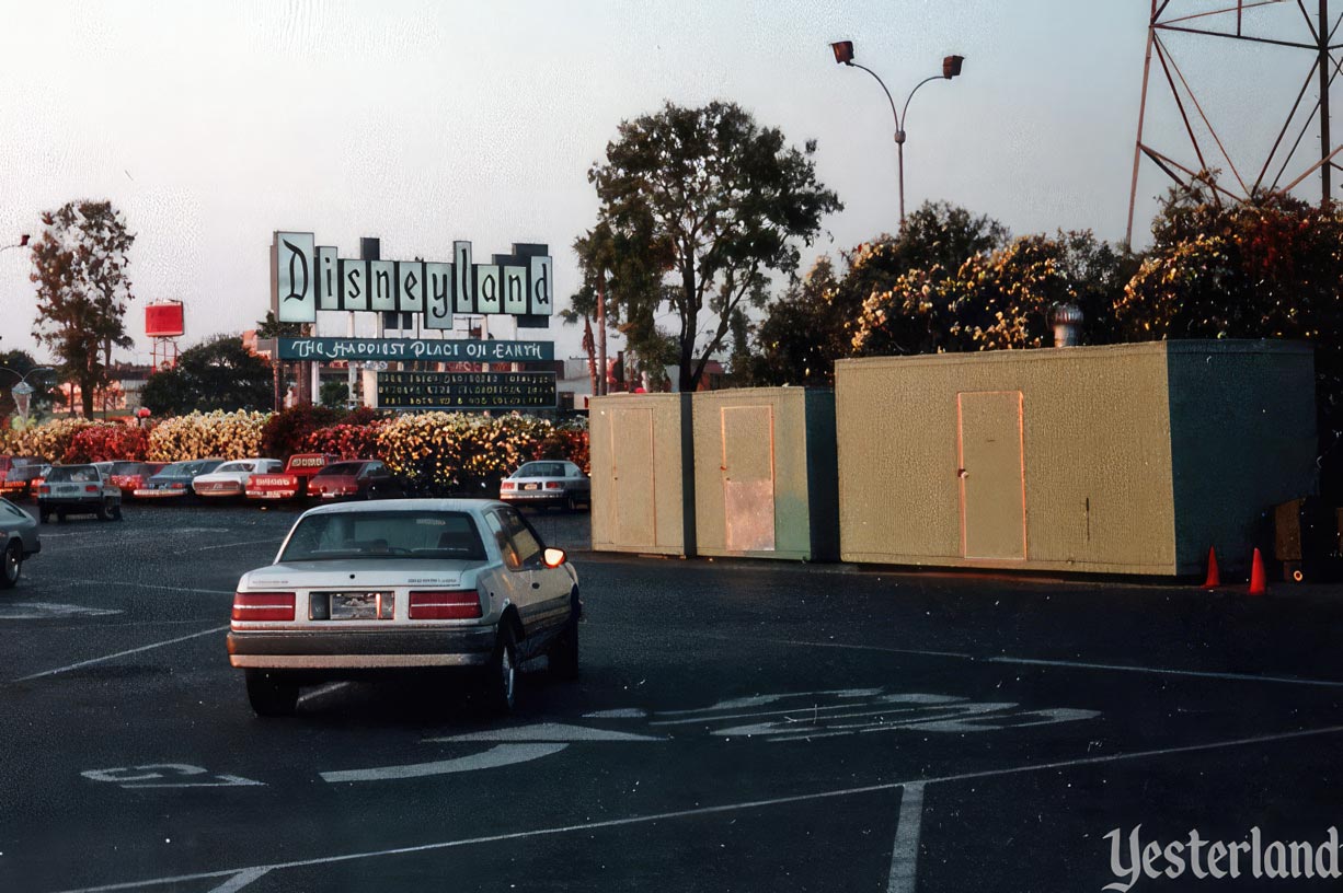
Photo by Chris Bales, 1989 The original sign toward the end of its life |
|||
|
Toward the end, in an apparent effort to modernize the sign’s appearance, the poles with the banners were eliminated. |
|||
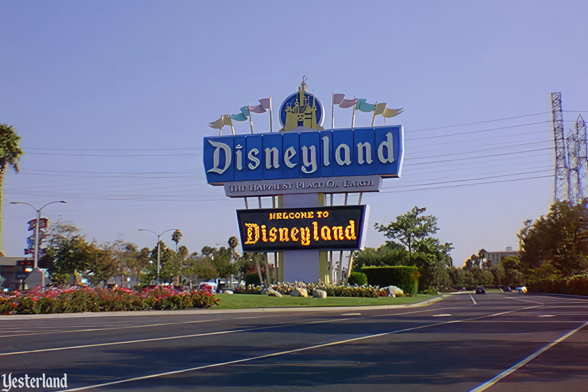
Photo by Allen Huffman, 1996 The newer Disneyland marquee sign (1989-1999) |
|||
|
In 1989, it was time for an entirely new sign. Here’s how the Los Angeles Times described the upcoming change (“Lights Fantastic, Tomorrowland Tech to Replace Disneyland’s 1959 Marquee,” by Mary Ann Galante, Times staff writer, March 23, 1989): The Disneyland marquee is changing, but the message will remain the same. In 60 to 90 days, Disneyland will be replacing its 30-year-old sign at the front entrance. In its place will be a new marquee 30% bigger—1,761 square feet—with electronic display boards to flash messages about the park and traffic instructions. “It’s going to look great,” said Bob Roth, park spokesman. In addition to the reader board with messages, the new sign “will have fiber optics, where we can change colors and do color combinations on the letters,” so colors can be switched from purple sheen to red to yellow, Roth said. What will not change is the message. The new sign will still proclaim Disneyland to be “The Happiest Place on Earth.” The newer sign went up right next to the original. For a short time in October 1989, both signs were up. |
|||
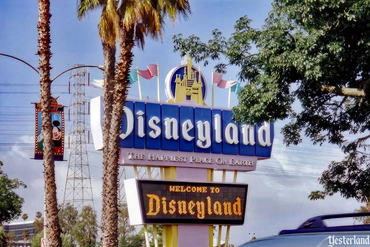
Photo by Ian Dick, 1995, via Flickr (CC BY 2.0) (modified) The newer sign from Harbor Blvd. |
|||
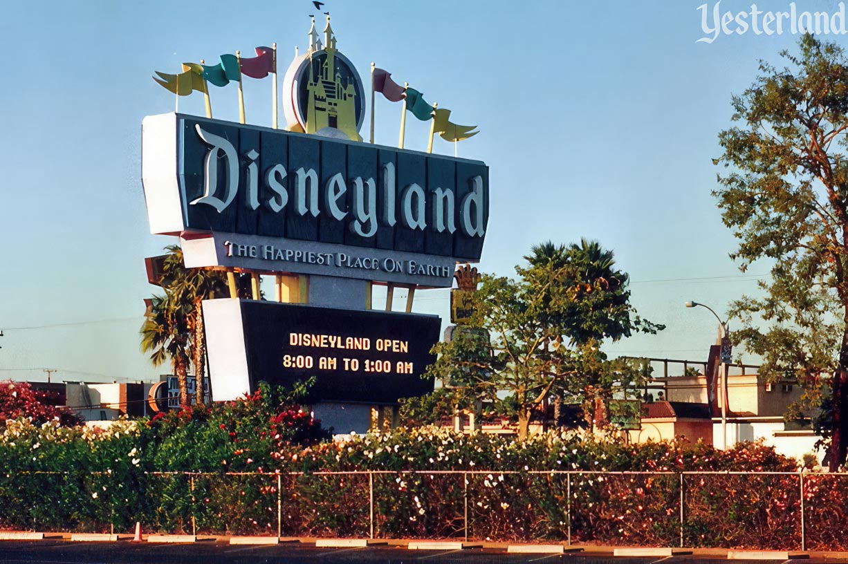
Photo by Chris Bales, 1996 The newer sign from the parking lot |
|||
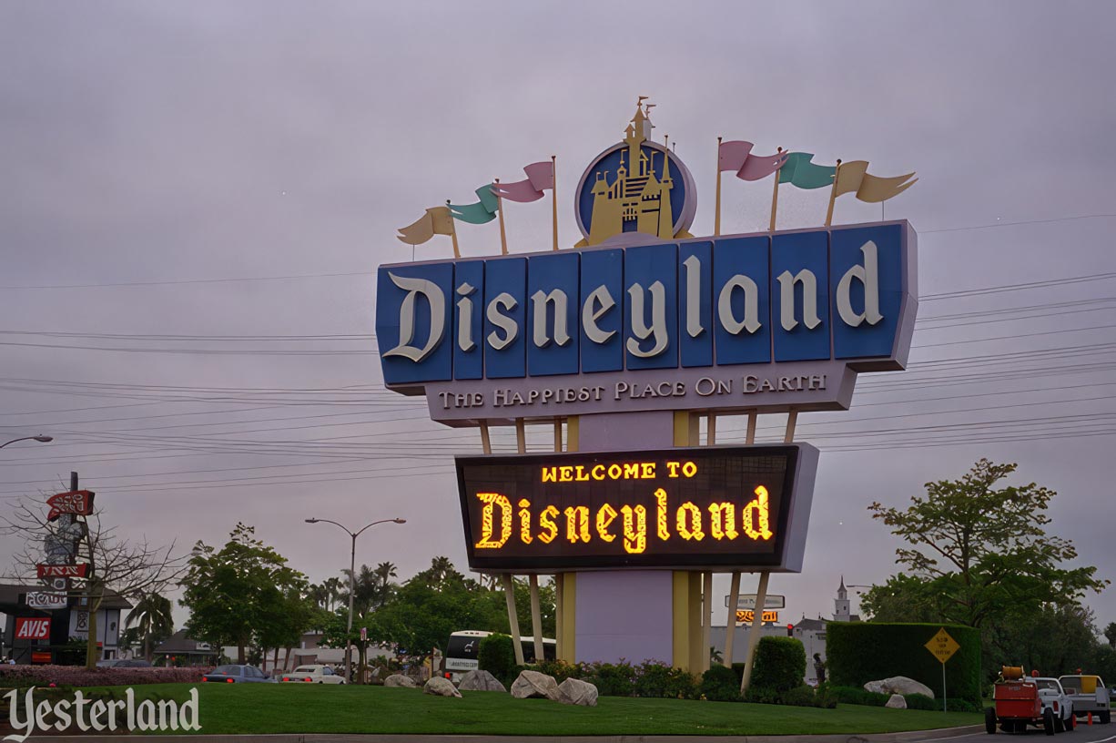
Photo by Werner Weiss, 1997 Computerized marquee |
|||
|
The marquee on the newer sign was not limited to fixed-size letters. An array of lightbulbs could be programmed with a rotation of text in various sizes and fonts, as well as animated graphics. |
|||
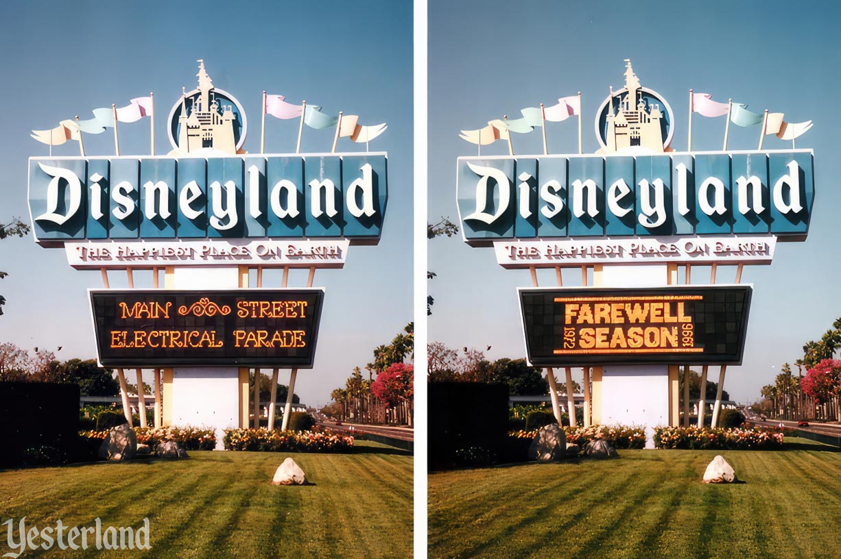
Photos by Chris Bales, 1996 Computerized marquee |
|||
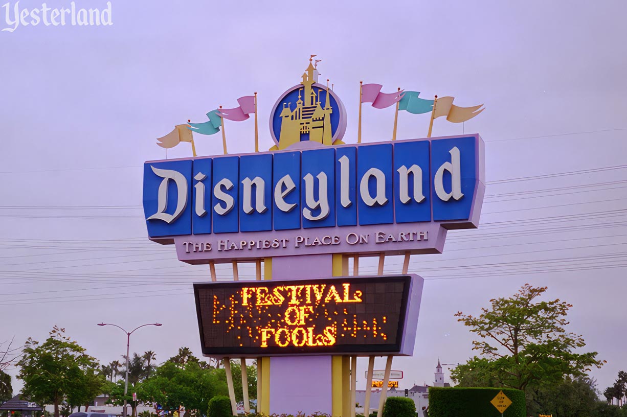
Photo by Werner Weiss, 1997 Festival of Fools logo in transition |
|||
|
The second sign stood for almost ten years. It was dismantled mid-June 1999 as part of the transformation of chaotic (but vibrant) Harbor Blvd. into part of the cleaned-up Anaheim Resort—and of the Disneyland parking lot into a second theme park. Instead of disposing of the sign, Disneyland put it up for auction on eBay. Actor John Stamos, the winning bidder, erected the giant D in the backyard of his home in the Santa Monica Mountains. The other side was purchased by superagent Richard Kraft, who eventually decided to take the giant D from the Disneyland Hotel instead. Disneyland would need a new sign—but it would not be just for the “Park & Hotel - Entrance” or “The Happiest Place on Earth.” Now it would be for the Disneyland Resort, the umbrella name for what would be two theme parks, three resort hotels, and a shopping and dining district. |
|||
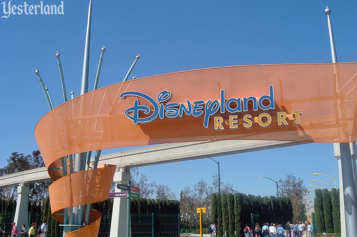
Photo by Brandon “nemofinder22,” 2005 Disneyland Resort sign |
|||
|
The next sign would be completely different than what it replaced. More modest in size, it sported a new logo. Presumably, the decision-makers felt the Disneyland Resort needed a separate visual identity from Disneyland Park, which would keep its iconic Gothic script logo. The new logo had “Disney” from the corporate logo of The Walt Disney Company (loosely based on Walt Disney’s signature), followed immediately by “land” in a Futura font, with “Resort” in heavier, more-widely-spaced Futura below it. Some fans welcomed the separate identity, while others thought it looked clumsy and lacked charm and tradition. The Disneyland Resort sign in the above photo—positioned for pedestrians who crossed Harbor Blvd. up by the IHOP—was one of several signs along Harbor Blvd. and Katella Ave. There would also be an arch over the parking lot entrance at Harbor Blvd. and Disney Way, as well as another pedestrian entrance on Katella Ave., across from the Anaheim Convention Center. Those signs—and how they changed over the years—are the subject of Part 2. |
|||
|
|
Click here to post comments at MiceChat about this article.
© 2023 Werner Weiss — Disclaimers, Copyright, and Trademarks Updated June 9, 2023 |
||